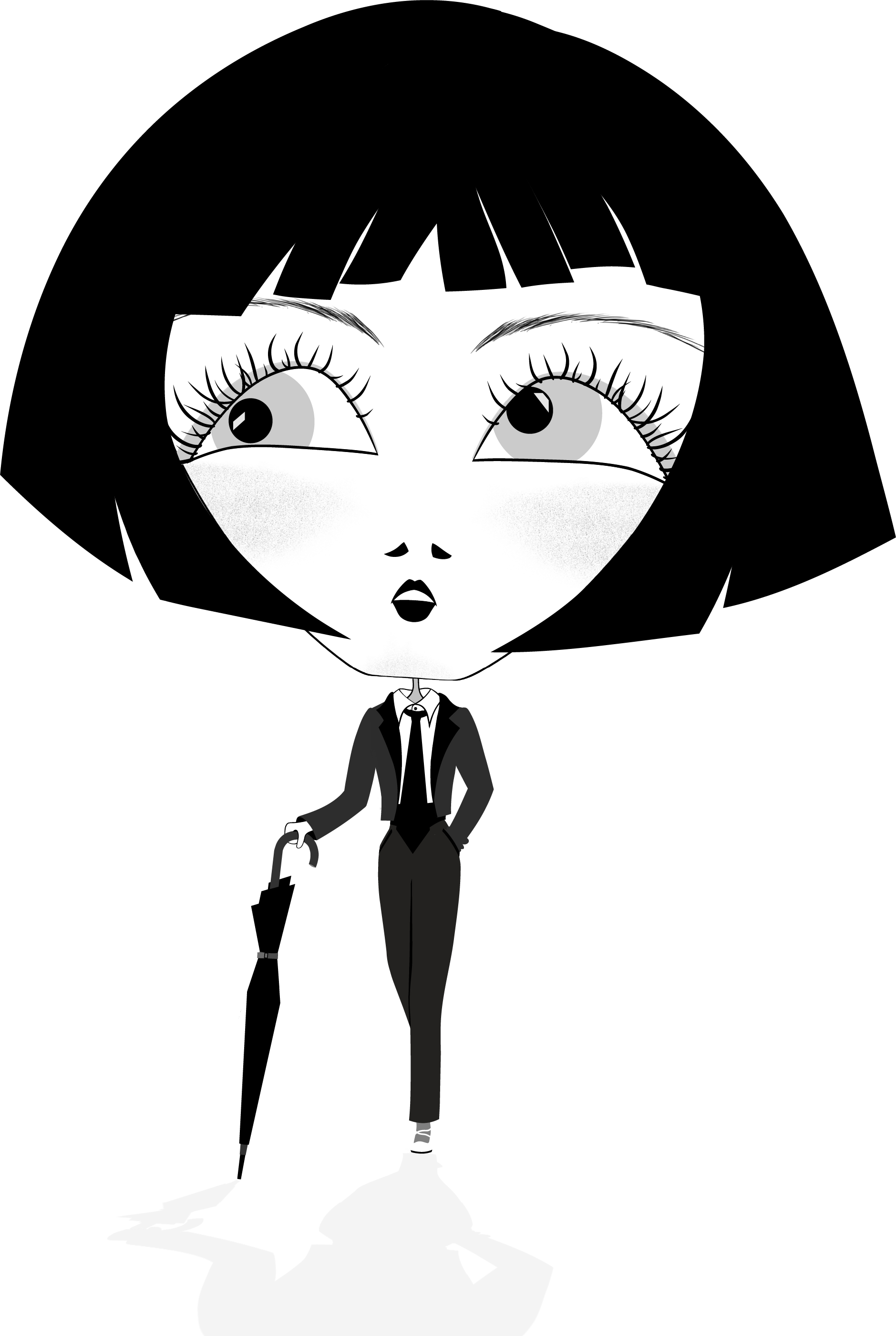
Georgette and The Power Suit: Editorial Identity Concept

Role: Illustration & Design Strategy
Client: Self-Initiated Concept Study
Art Direction (AD): Rosário Durão
Copywriting: Rosário Durão & Strategic Partner

The Problem:
Capturing Defiance and Ambiguity

The conceptual challenge was to capture the theme of "blurring lines, fashioning identities" and "Elegance with an edge, challenging conventions," a statement inspired by a young woman, the original "Georgette," whose confident, androgynous presence I observed in the Rossio metro station. The visual solution needed to translate this fleeting moment of defiance and strong yet graceful movement into a sophisticated editorial spread that communicated complexity and ambiguity while adhering to a clean, structural design aesthetic.

The Strategic Action:
Compositional Rigor and Narrative Symbolism

The final spread is the result of applying strategic design rigor (informed by my technical communication background) to an authentic personal observation, ensuring the final visual is intentional, not accidental.

1.

Authentic Conceptual Genesis: The process began immediately with sketches capturing the subject's androgyny and demeanor. I then strategically reimagined the figure as an androgynous flâneur—a classical literary figure symbolizing movement and observation—walking a stylized, classy city street. This context transforms a fashion illustration into a discussion of identity.

2.

Strategic Research and Context: I conducted research into the cultural history of the power suit to ensure the concept was layered with historical and editorial relevance.

3.

High-Contrast Color as Metaphor (Clean Aesthetic): The color palette was deliberately restricted to black and white, mirroring the suit and creating maximum contrast. This choice not only adheres to a clean, sophisticated aesthetic but serves as a visual metaphor for the ambiguity and complexity inherent in "blurring lines." The powerful symbolism of red was strategically reserved for the title, "THE POWER SUIT," to introduce a precise symbolic contrast (defiance and power) against the monochrome base.

4.

Layout and Composition: The final presentation in a two-fold magazine layout (editorial spread) was chosen to maximize visual impact and demonstrate a clear understanding of editorial design constraints, ensuring the layout reinforces the concept's high contrast and ambiguity.

Result:
Strategic Editorial Storytelling

This project successfully validates my ability to generate complex, research-backed narratives from simple, authentic observations and deliver them in a professional, high-impact editorial format.

The Georgette and The Power Suit concept delivers:

  • Editorial Readiness: The final mock-up and clean, high-contrast composition confirm a professional understanding of editorial constraints, appealing directly to lifestyle and fashion editors seeking sophisticated identity narratives.

  • Proof of Conceptual Depth: The process validates my capacity to integrate deep conceptual themes (flâneur, androgyny, ambiguity) into a unified, clean visual narrative.

  • Authenticity and Intentionality: The documented journey from personal inspiration to strategic layout shows that the work is driven by authentic curiosity but executed with meticulous, commercial precision.