Project: Self-Initiated Illustration for Film Festival Ad
Art Direction (AD): Rosário Durão
Tools: Adobe Illustrator
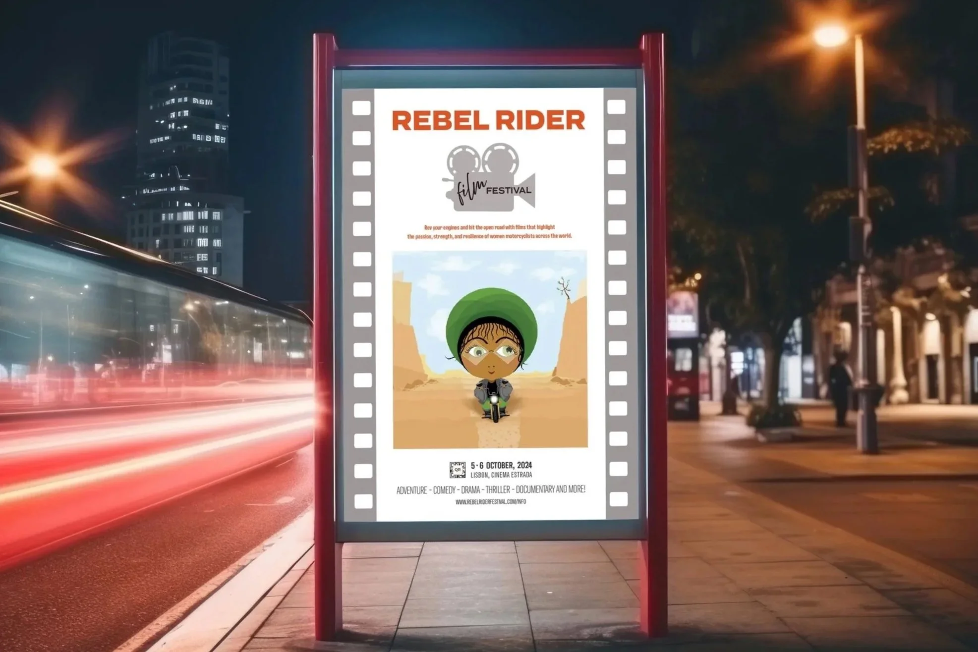
On the Road is a self-initiated campaign illustration for a film festival celebrating women riders. Built on a foundation of movement and open settings, the piece captures the energy of independence, confidence, and the joy of the open road.
It’s a conceptual look at how posture and momentum can express strength and agency without a detailed storyline. Designed with editorial clarity, the project illustrates how cultural themes can be transformed into engaging imagery suited for campaign and lifestyle use.