Project: Book Cover Lettering – The Big Ampersand (Self-initiated)
Art Direction (AD): Rosário Durão
Tools: Adobe Illustrator
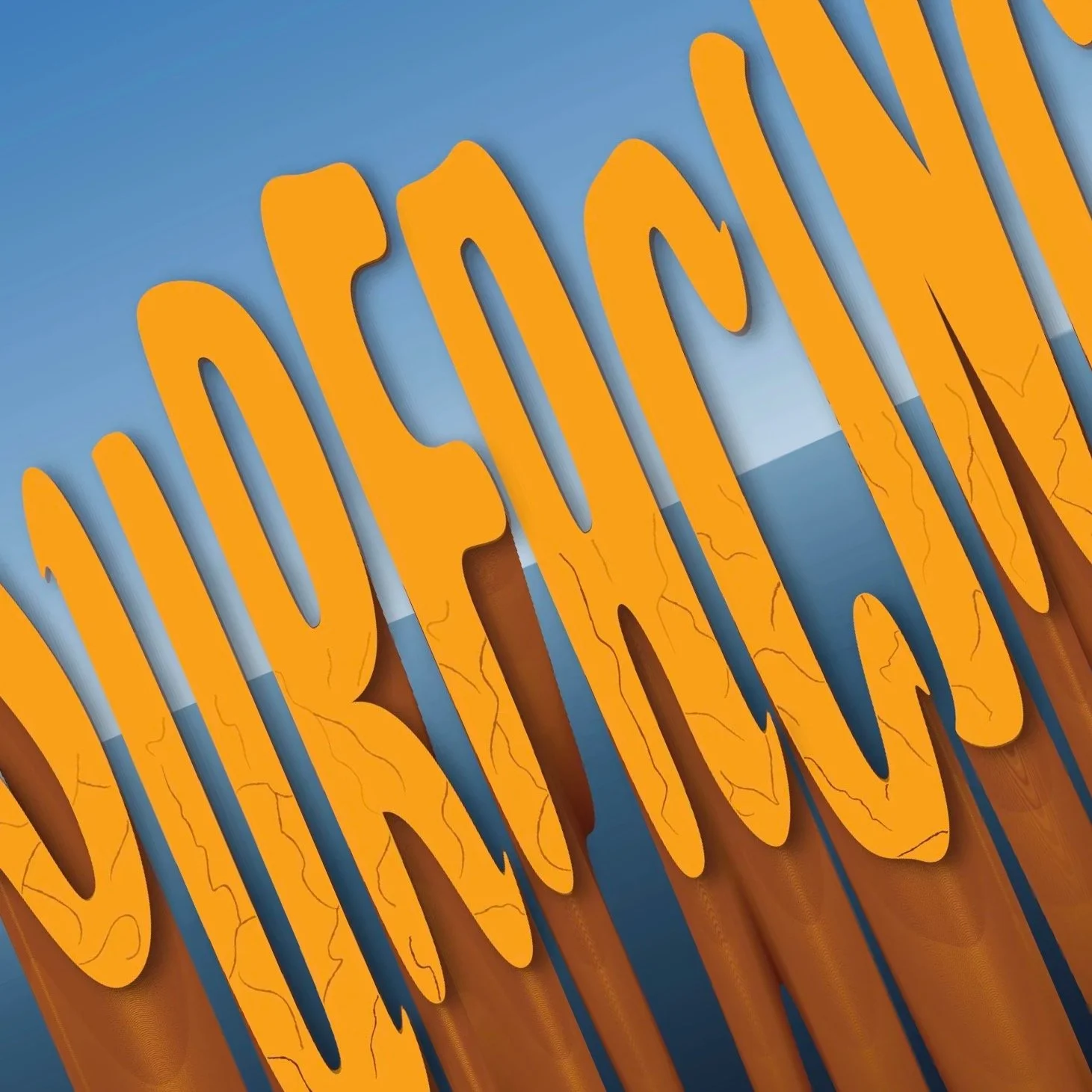
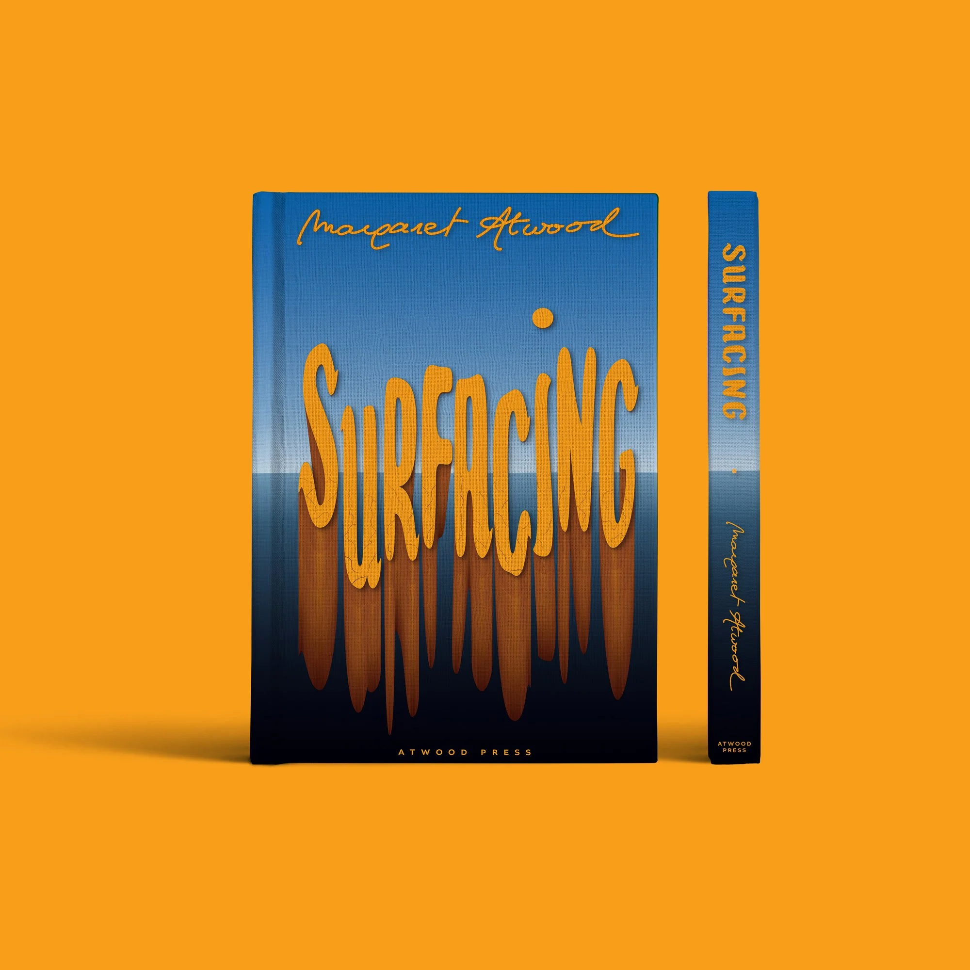
Surfacing reimagines Margaret Atwood’s novel through custom typography that carries the narrative weight of psychological fracture and rebirth. Built on a foundation of tall, dimensional letterforms, the design uses depth and shadow to evoke the tension between sinking and emerging.
It’s a research-led approach to editorial illustration where the style of the author’s name was inspired by her signature. The project demonstrates how technically precise typography can create a high-end, marketable presence for literary publishing.